
Matt Kartozian-USA TODAY Sports
Over the next month, we at FanGraphs will be highlighting a number of site features and showing you how we use them. The goal is to make your visit to the website more enjoyable, and to help you get the most out of the features we’ve added over the years. Today, I’m going to walk through the various ways we deploy projections to make predictions about the future. Let’s explore our projected standings and playoff odds pages.
Before I ever worked at FanGraphs, I spent countless hours messing around with the playoff odds page. I like learning about the future, or at least learning about many possible futures, and I always found the slow-changing nature of projections early in the season to be soothing as a Cardinals fan. Stressed about last night’s crushing loss? On May 15? I could always look to the odds page, see that the team’s chances had barely budged, and calm myself down.
Five years into working here, I still use many of the same pages I did then, but they’ve been upgraded a good deal in the meantime. Let’s start with the nerve center of our predictions, the page that shows everything that feeds into our much-discussed playoff odds: the Projected Standings. You can find them using the navigation bar at the top of the site:

Once there, you’ll be treated to a cornucopia of information:
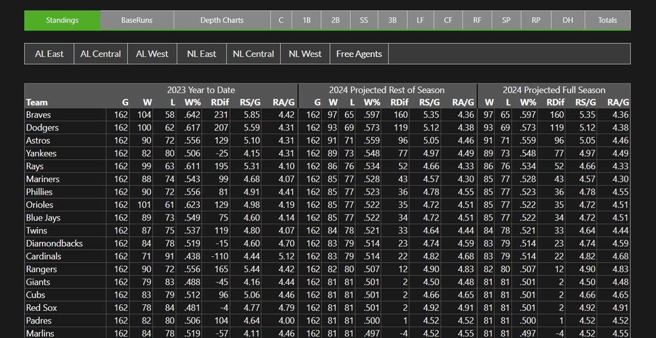
There are so many numbers here that it can feel overwhelming, so let’s walk through each part in turn. First, this page displays each team’s season-to-date record, along with the run-level components of it. It’s pretty standard stuff, but I like to look at it in conjunction with the next column: projected rest-of-season record. You can see how many runs we project each team to score and allow, and how that translates into both run differential and winning percentage. Comparing those rest-of-season numbers to what’s already been accumulated can give a good sense of which parts of a team are doing better or worse than the projections would imply.
You’ll have to accept a hypothetical, since no regular season games have been played in 2024, but imagine that after 30 games, the Diamondbacks are scoring five runs per game while allowing 4.6 en route to a juicy .540 winning percentage. Assuming our projections haven’t changed from what we’re displaying now, you could compare it to their rest-of-season projections – 4.74 runs scored, 4.59 allowed, .514 record – and get the download on what’s gone on so far. The offense is doing better than our models expected, while the pitching is right in line, which explains the better-than-expected winning percentage.
I find this incredibly useful when I’m trying to sort through the noise of the season and see what a team has been doing right and wrong. If you don’t have a baseline projection to compare to, what a team has done so far feels like the only possible thing that could happen in the future. Comparing that to what two projection systems (ZiPS and Steamer) think about each individual player on that team going forward injects some reality into the equation and gives you an easy way to say, at a high level, what’s been working particularly well or poorly relative to expectations.
How do we turn those player projections into the rest-of-season projections you see? We allocate playing time to each player, and you can easily see how your team’s playing time is allocated right from this page. Hover over the team’s division and a drop-down menu will appear. Click on their name, and you’ll be transported to their depth chart, complete with projected playing time and rate statistics for every player:
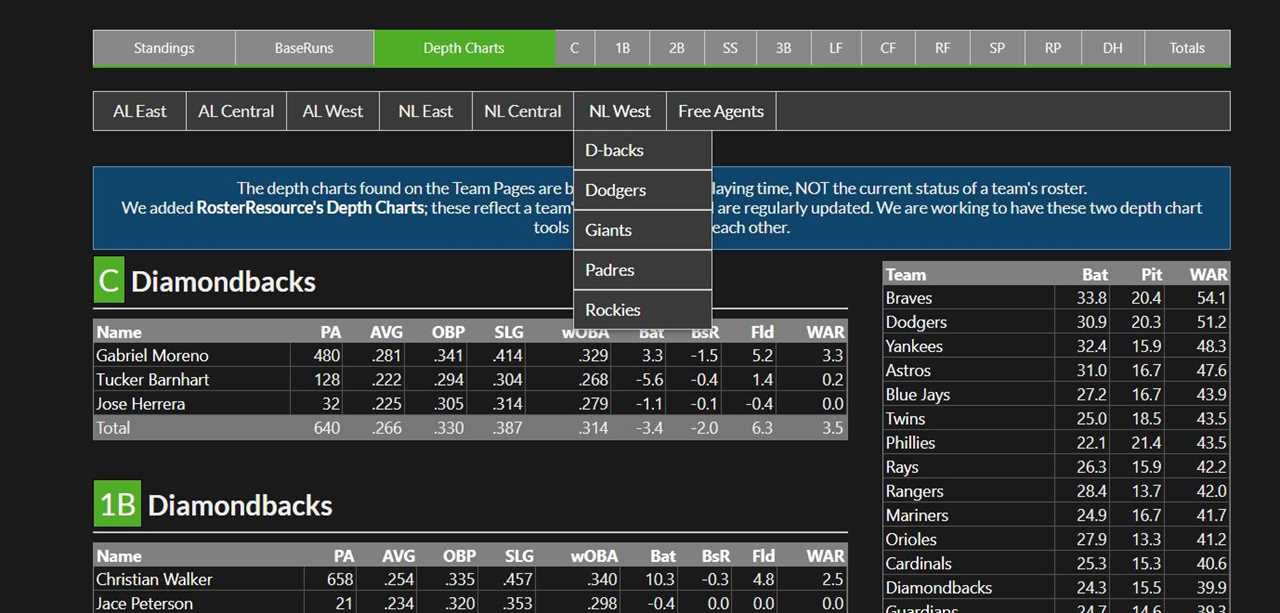
I’m showing that tab mostly for illustrative purposes – in my experience, spending too long trying to figure out whether your team’s projected winning percentage would improve by six points if they shuffled the first base and DH playing time around is more trouble than it’s worth. But if something in our projected run scoring and prevention numbers looks off to you and you want to dig into it, the constituent projections are easy to find.
Next, let’s double back to the games that have already been played. Runs scored, runs allowed, run differential, and winning percentage are useful, but they scream out for more context. What record should a team with a -15 run differential, like the 2023 Diamondbacks, have? How would they do if they followed the Pythagorean expectation, which estimates a team’s winning percentage based on their run scoring and prevention? Not to worry, there’s a tab for that. Back on the main projected standings page, the BaseRuns tab has what you’re looking for:
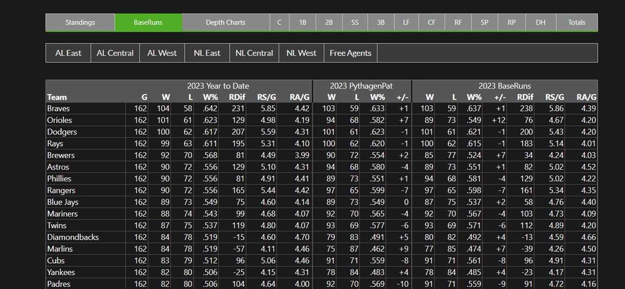
The first group of columns on this page recreates the main tab. You can see a team’s season-to-date numbers, in this case for the entire 2023 season. The middle group of columns uses PythagenPat, a modified version of Pythagorean expectation that handles the run scoring environment better, to show what a team’s record would be if they had neutral luck in terms of clustering runs between games. In other words, it gives less credit to teams that win a pile of one-run games while losing blowouts by assuming those runs were more evenly distributed.
That’s a pretty standard team-level statistic these days, but the final group of columns is much better than Pythagorean expectation when it comes to estimating a team’s level of play. Clustering runs between games is one thing, but what about clustering hits? One day, you might spread out three singles, four walks, and four doubles across nine innings and score only two runs. The next day, you might rack up the same tally of bases but score seven because of one huge inning. BaseRuns estimates how many runs a team would score in the long run based on its individual play-level results, and as such it’s a better way of explaining how a team has played than simply looking at its record or its run differential.
You can see from these two columns that the Diamondbacks won a few more games than you’d expect based on their run totals (79 wins) or their component outcomes (80 wins). At the end of the year, wins are wins, and no team is hanging a BaseRuns Champion banner in the stadium. But on June 1, if your team is scoring five runs a game but their season-to-date BaseRuns states that they have the individual play-level offensive components of a team that scores only 4.5 runs per game, you can infer that they’ve had some fortunate sequencing so far. Likewise, a team scoring 4.2 runs with a BaseRuns mark of 4.7 has been unfortunate.
I find that instructive when I’m trying to estimate how good teams are, but also when constructing and enjoying my own narratives. Can the Orioles keep cashing in more runs than you’d expect (4.98 RS/game vs. 4.67 BaseRuns)? Will Phillies pitchers keep letting too many runs slip through for how dominant they are (4.41 RA/game vs. 4.22 BaseRuns)? On the flip side, this page can also confirm that the thing your team is doing is good. The Braves offense wasn’t just getting lucky last year – they scored 5.85 runs per game, and their BaseRuns checked in at 5.86. Whether you’re looking for a sanity check or to find a fun plotline to follow, this page has you covered.
I mentioned that the rest-of-season projected winning totals on the projected standings page were driven by our player-level projections. The winning percentages you see on that page are constructed by adding up how many runs we expect a team to score and allow for the rest of the season, then feeding that into PythagenPat. That gives us an expected record against neutral opposition. In turn, we feed that into our playoff odds page, and that’s where the fun really starts.
The playoff odds sit on the navigation toolbar just below the projected standings. They display our best estimate of how likely each team is to make the playoffs given how they’ve done so far in the season, their remaining schedule, and their current roster.
The main playoff odds page can feel overwhelming. There’s a lot going on:

If you’re looking for exact documentation of how each type of projection works, we have that here. I’m going to skip that today in the interest of brevity and talk about how to navigate the display. Let’s start with that screenshot above and look at the AL East. First, you’ll see each team’s 2024 results – 0-0 at this point, obviously. Next, you’ll see their projected 2024 record, as well as their strength of schedule. We wrap existing record and the average of 20,000 simulated seasons into that number to estimate how many games each team will win on the season as a whole. We also display the average projected winning percentage of a team’s remaining opponents, as well as their average winning percentage across all runs of the games we simulate.
That’s just us showing our work. The output of the playoff odds is on the right side of the table. First, there’s the top-line number, which we highlight and sort by as a default: the odds that each team will make the playoffs. That’s straightforward: It’s simply the number of simulated seasons where a team finishes the year in playoff position divided by 20,000.
Qualifying for the postseason isn’t the only metric that matters anymore; in baseball’s new postseason format, two teams in each league get to skip the first round of the playoffs. Our odds also display the chances of that happening – under “Clinch Bye” – as well as the odds of winning the division. The odds of clinching a bye will always be lower than those of winning the division, of course, since every bye goes to a division winner but not every division winner gets a bye.
Naturally, since we’re simulating out the entire season, we also simulate the playoffs. You can see each team’s chances of winning the World Series, and if you’re particularly interested in the round-by-round breakdown, you can view that as well:

If you’re using FanGraphs as a baseline for playoff odds, you probably already knew all that. But the odds tool is much more versatile than that one tab. Want to see what the odds were like a week ago? It’s easy. Click on the date, select any day you want from the dropdown, and the odds will update to show you that day. Here’s the AL East on September 1 last year, for example:

Don’t feel like selecting your own date? Not to worry, “Quick Dates” has a selection of dates you might want to use. It covers the start of each previous season, and as the current one rolls on, you’ll be able to find quick dates from a week ago, 30 days ago, and so on.
There’s no need to stop there. If you’re looking at a date in the past, you’re probably wondering how that compares to the present. That’s only one mouse click away; simply navigate up to the “Display Options” dropdown and select “Changes”:
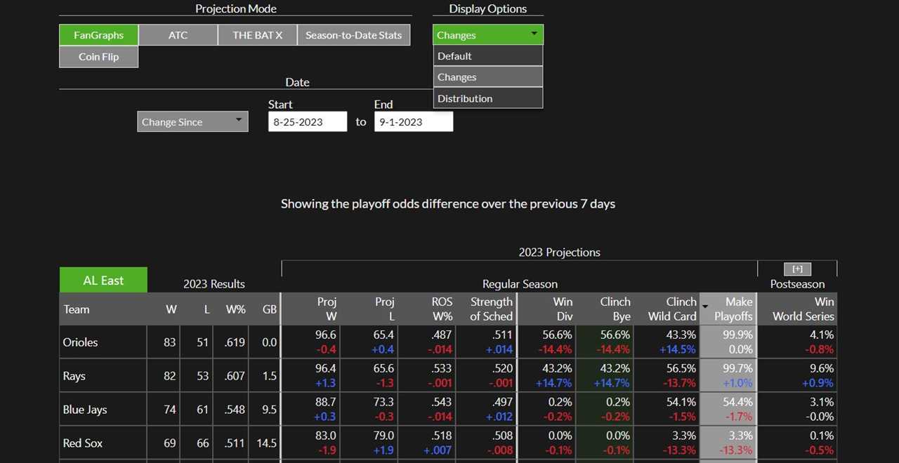
On the Changes page, you can select any two dates within the same season and see how each metric displayed in our regular playoff odds page changed between the two of them. In the above screenshot, you can see that a hot week for the Rays brought them back into the divisional race (14.7 percentage point increase in division odds) but didn’t do much for their overall playoff odds because they were already shoo-ins. If you’re inclined to dig into the projections, you can also click on “Distribution” to see a graph of our simulations, but that’s more for the completionist than anything else.
Of course, sometimes seeing two dates still isn’t enough. Again, though, there’s a solution. Simply click on “Graphs” at the top of the playoff odds page, pick your season and division, and you can see how the race of your choice unfolded over time. Here’s how that race for the AL East title went down last year:
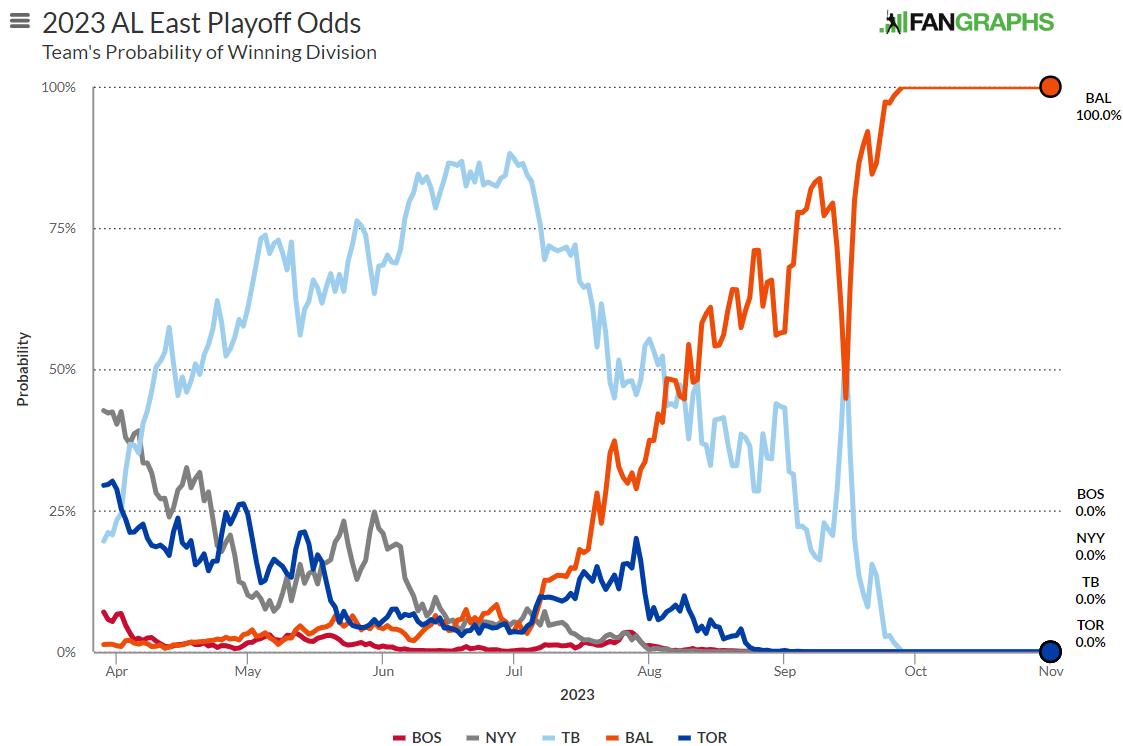
That tells more of a story than one single table ever could. The Orioles built in strength all year, had a brief blip in September, then easily righted the ship and cruised to the title. You could also look at a team’s odds of winning a postseason round (let’s be real, you’d pick the World Series), and get a fun graph like this visual representation of the Astros and Rangers trading blows in the ALCS:
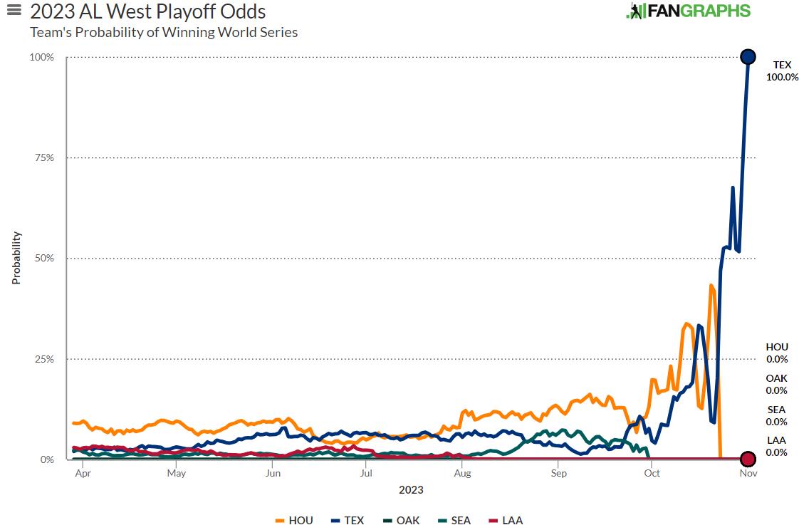
That sawtooth pattern at the end of the year is phenomenal; it’s a great representation of how the seesawing fortunes of each team within the series changed their chances of taking home the whole ball of yarn. In general, the playoff odds graphing tool is great for just that; you can see a season recapitulated in miniature, slow rises and sudden falls alike.
I’ve covered a lot of information today, so I’ll close with a quick recap of it all. If you’re looking to see how a team has performed this year, both in actuality and in terms of underlying production, the projected standings have you covered. If you’re wondering what that all means in terms of October, the main playoff odds page is your best bet. If you want to see how fortunes have changed over time, you can use the changes or graphs tab. We collect and store a wealth of information related to our playoff odds, and if you know where to look, they’re all only a few clicks away.
Source
https://blogs.fangraphs.com/fangraphs-spotlight-use-our-playoff-odds-pages-like-a-pro/
 Backyard GrillingWeekend WarriorsAdvice from DadBeard GroomingTV Shows for Guys4x4 Off-Road CarsMens FashionSports NewsAncient Archeology World NewsPrivacy PolicyTerms And Conditions
