Manly Sea Eagles have cultivated an impressive tradition of being defiant, standing apart from the other rugby league clubs in the premiership with great success.
For no seemingly good reason they have decided to change their logo to a generic one that screams “we’re going to blend into the crowd”.
That’s not what this club is about – they’re Manly, the Silvertails who proudly say we know you hate us and we don’t care.
The previous incarnations of the club’s logo were unique in that they incorporated the old-school flavour of rugby league badges with a distinctly Manly maroon flavour.
If you didn’t read the mountain of marketing guff which accompanied the release of the new logo this week, you could be forgiven for thinking this logo was one of an NFL team, an Angry Birds spin-off or as many unkind souls have pointed out on social media, an homage to Foghorn Leghorn.
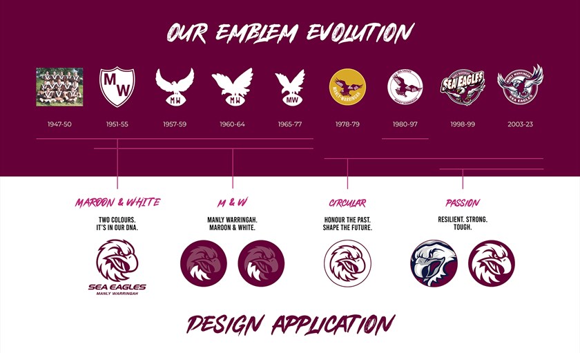
According to those who are drunk on maroon Kool-Aid in Sydney’s northern beaches, there are four whizz-bang reasons why this logo is supposedly a “new era” for the Sea Eagles.
It uses only maroon and white “like traditional logos seen from the club’s inception until 1977” – great, but was any Manly fan offended by the small patches of black on the wings of the previous logo?
There is a “familiar circular motif that the Sea Eagles have incorporated from 1978” – which makes it look like the vast majority of every other sporting logo.
The logo incorporates a “sign of strength seen in the aggressive eagle features from the 2003-2023 emblem” – it does kinda look angry but more in a cartoon way.
It has a “slanted typeface representative of forward movement and progress, with Manly Warringah clearly showcased to represent the club’s historic name” – visionary! The font leans a little to the right, like the local political constituents and the club is expecting a round of applause for putting the team’s name on the badge?
Apologies to those of you who had to reach for your sick bag after being exposed to that corporate vomit-speak.
Funnily enough in all their propaganda promoting the Manly tradition over the years, there’s a gap from 2000-02 where no mention of badges, jerseys or the ineptitude of those seasons.

It’s almost like they’re trying to rewrite the club’s history to wipe away any trace of memory for the Northern Eagles shotgun marriage with the Bears, who are still licking the wounds inflicted right between their shoulder blades.
If you think of the iconic logos for professional clubs the world over, ones like the New York Yankees, Manchester United, Green Bay Packers, Chicago Bulls, FC Barcelona have stood the test of time because they incorporate tradition and fans identify with them.
There’ll be a fair few old Manly players now sporting premiership tattoos with a logo different to the one the team will run out wearing in 2024.
When it comes to NRL clubs, South Sydney and St George Illawarra stand out as the two most recognisable logos because they are the ones who have barely tinkered with their designs over the decades.
Souths have stayed true to their legendary bouncing white rabbit and no motorist in Sydney has driven out of a postcode without seeing one of those decals on the back of someone’s car windscreen.
The Dragons’ logo is not the same as the ye olde one from their glory days of the 1950s and ‘60s but it stands out as a simple yet effective design which the St George end of the joint venture said was a non-negotiable element of their merger with the Steelers in 1999.
Their only concession was Illawarra displaying across the bottom of the badge.
There was a trend towards a switch to cartoonish logos in the NRL a quarter a century ago with the Sharks, Bulldogs, Eels and Roosters going down that path.
Significantly all of them went back to traditional style badges within a few years.
Sporting logos in the grand scheme of things don’t particularly matter much at all, except to fans. And that’s why they are important.
Manly’s decision to change will likely make not one iota of difference to the team’s chances next season but they will rake in a few extra dollars because the diehards will want to update their merchandise with the latest range.
The last time the marketing department made a major change to their apparel with a few rainbow stripes for the 2022 “inclusivity” jersey it ended in disaster (and a Des-aster for coach Hasler) so at least this time around no one will get fired. Well, not yet anyway.
https://www.theroar.com.au/2023/10/19/meh-nlys-new-generic-logo-is-yet-another-example-of-ill-conceived-marketing-overruling-tradition/
 Backyard GrillingWeekend WarriorsAdvice from DadBeard GroomingTV Shows for Guys4x4 Off-Road CarsMens FashionSports NewsAncient Archeology World NewsPrivacy PolicyTerms And Conditions
