As you might imagine, as the owner of MLB Trade Rumors, I am a heavy user of the website. When it comes to website traffic, 80% of ours comes via mobile devices, so I often navigate the site on my phone. In recent years, I’ve experienced difficulty in getting good results from MLBTR’s search tool, as well as in general navigation. This year, I set out to fix that.
I started by gathering data on what MLBTR users usually search for, and I found that in the offseason it’s almost always a player name, team name, or an attempt to find free agent-related links. Within the limited real estate of MLBTR’s mobile web navigation bar, we’ve made it easier to find those things.
Previously, the search icon was not on the home screen; it was instead buried within the “three lines” menu. We’ve moved that to the main navigation bar in the upper left, signified by the classic magnifying glass icon:
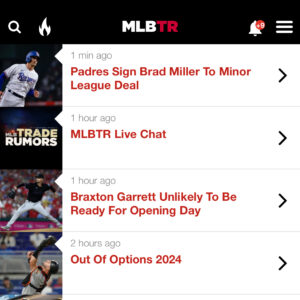
Given the indication that people tend to search for player or team names rather than specific post headlines, we’ve limited the autocomplete to players and teams. Type a few letters of the player’s name and you’ll see the options:
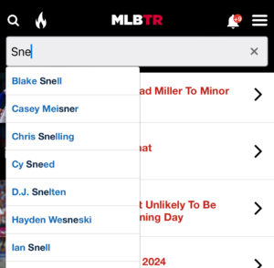
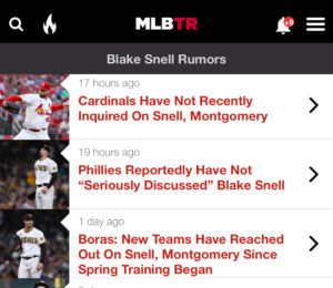
This allows you to get to the player’s chronological archive quickly and easily, where you’ll see the latest posts on him at the top. It’s also helpful for difficult-to-spell player names. Here’s what a player page looks like:
When it comes to navigating to the team archives, I grappled with the best way to do it. Previously, we had a Teams link in the navigation bar on the mobile website. In practice, I didn’t think using this link on a phone was all that convenient – especially if you were seeking a team name in the middle or end of the alphabet. You’d hit Teams and then often do a fair bit of scrolling and then pick out your team from the list of 30.
The new way to get to the team page is to type a few letters of that team name into the search box. You can start with the city name or the team name. Usually about three or four letters does the trick:
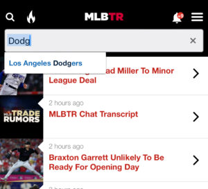
That’ll bring you to our team archive, with all posts tagged with that club in chronological order:
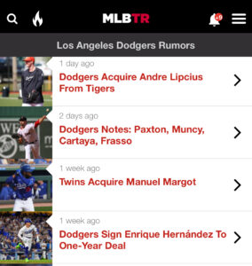
Though the autocomplete function in the search box gets you directly to player and team archive pages, there may be cases where you have a specific post in mind. You can still type any phrase into the box and then hit the Search button on your phone to get more algorithmic results rather than our human-curated player and team archives.
I also wanted to solve the issue of finding free agent-related links easily, while keeping some flexibility to curate a few relevant links depending on the time of year. To accomplish this, the “flame” icon was born. Tapping that brings you to various “hot” and timely reference links:
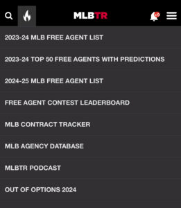
We’ll change some of these links at different times of year, for example putting some trade-related links up in July.
In my experience, these changes to the MLBTR mobile website navigation bar have made the site faster and easier to navigate. If you have any questions or comments, please leave them below.
https://www.mlbtraderumors.com/2024/03/navigation-improvements-made-to-mlbtr-mobile-website.html
 Backyard GrillingWeekend WarriorsAdvice from DadBeard GroomingTV Shows for Guys4x4 Off-Road CarsMens FashionSports NewsAncient Archeology World NewsPrivacy PolicyTerms And Conditions
