
Rob Schumacher-Arizona Republic
Last year, I took a long look at the predictive power of rookie exit velocity. One of the things I learned was that for rookies with at least 200 balls in play, wRC+ was less predictive of their future performance than max exit velocity. That blew my mind. Knowing just one measurement, the velocity of a player’s hardest-hit ball, was more useful than knowing about their overall performance through their entire rookie season. Exit velocity matters a lot, as does how you interpret the data.
Since the rollout of Statcast in 2015, we’ve been introduced to three general ways of thinking about exit velocity, along with half a dozen individual variations. Depending on the context, we might read about a player’s average exit velocity, their maximum exit velocity, their hard-hit rate, or any number of exit velocity percentiles. For a while now, I’ve been wondering which one of these methods is most useful. Could there be one exit velocity metric to rule them all?
I have to imagine that at some point in the last several years, the R&D department of each major league team has asked itself that exact same question. In each big league city, someone much smarter than I am did the math and wrote up the results in a report that now rests comfortably in a proprietary database with a catchy name. The rest of us just have to make do with rumors and innuendo suggesting that teams most often value something akin to 90th-percentile exit velocity. To my knowledge, no one in the public sphere has made a comprehensive survey, and I wanted to look into the matter for myself.
I pulled the exit velocity for every batted ball hit during the 2021, 2022, and 2023 seasons and crunched the numbers. Then I asked my friend Mike to pull the batted ball data (because I felt pretty sure I’d screwed something up along the way) and crunched those numbers too. Then I stopped to play Number Munchers. After I got eaten by a troggle, I organized the data in three ways. First, I essentially did a longitudinal study. I wanted to look at the big picture and find out how well each method correlated with success when we had lots of data. I combined all three seasons worth of data, and got a sample of 398 players with at least 300 tracked balls in play.
Next, I broke things down by season to track year-over-year changes. I ended up with 610 sets of back-to-back player seasons with at least 100 tracked balls in play. Lastly, I wanted to check how the metrics handled very small samples, so I focused only on players who had between 30 and 110 balls in play in one season, and then at least 30 in the following season, leaving me with 165 sets.
Before I tell you what I learned, here’s a refresher about the three statistical methods for breaking down a player’s exit velocity data. You likely know most of this, but I think it’ll be helpful to have it in one place.
Average Exit Velocity/Best Speed
Average exit velocity has been with us since the beginning of the Statcast era, and its main draw is its simplicity and ubiquity. No one needs the concept of an average explained to them, and you can look up any player’s EV right here at FanGraphs. It’s also very easily improved upon. Baseball Savant’s own Tom Tango is not a fan, saying average exit velocity is “a stat I always ignore,” and calling it “the worst thing to rely on.”
Tango is a proponent of Best Speed, which is still an average. The difference is that best speed sorts a player’s batted balls by exit velocity, throws out the weakest half, and takes the average of only the remaining, hardest-hit half. A ball hit at 40 mph and one hit at 60 are both almost certain to end up as outs, so why let them add unnecessary noise to the sample? As Tango put it on his blog last year, “The reality is that we learn nothing about a batter on their slow hit batted balls.” He published the chart below to show why he settled on 50% has the cutoff.
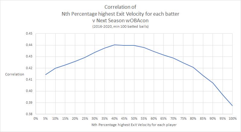
For each season with at least 100 BBE, Tango calculated the correlation coefficient between best speed and wOBAcon in the following season. In addition to being a nice, round number, 50% is where it became most predictive of success on balls in play.
Best speed also tends to be sticky from year to year. There have been 1,080 cases where a player had at least 100 tracked batted balls in two consecutive years, and those players have changed their best speed by more than one standard deviation just 6.6% of the time.
Best speed was added to Baseball Savant last fall, but I suspect most people don’t even know it’s there. It was released without any fanfare, and it’s not on the player pages or exit velocity leaderboard. In order to find it, you have to add it to your own custom leaderboard.
Exit Velocity Percentiles
Exit velocity percentiles are very similar to best speed, but rather than, say, giving us the average of a player’s top 50% hardest-hit balls, they just give us the actual exit velocity of their 50th-percentile hard-hit ball. It’s just the exit velocity of that one batted ball.
Back in the beginning of the year, Ben Clemens spent a few weeks digging through exit velocity data in search of 2023 breakout candidates. Specifically, he was focused on players with solid 95th-percentile exit velocity numbers but unimpressive average exit velocity numbers or contact rates. Since 95th-percentile exit velocity is a good stand-in for raw power, the idea was that the first group would take off if they could cut down on mis-hits and the second group would do so if they cut down on whiffs.
Ben hit on two important things: First, he referred to the measure as EV95, which is so much more concise that we should all start referring to EV percentiles that way. His second takeaway was that EV95’s usefulness comes in large part because it is extremely sticky, even stickier than best speed. With so little room for variance, you can’t fake 95EV.
Indeed, exit velocity changers are rare: only 4% of hitters saw their 95th-percentile exit velocities change by at least one standard deviation from one year to the next.
…
If you want to know why analysts focus more on top-end power than average exit velocity, here it is in a nutshell. In a given year, 15.8% of batters see their average exit velocity improve or decline by at least a standard deviation. It’s a noisy statistic, in other words; you might think that you can tell the difference between two hitters based on their average exit velocities, but there’s a decent chance that you’re being deceived by variance. Hitters change their average exit velocities by a whole standard deviation four times as frequently as they change their top-end power.
Over at Pitcher List in 2021, Jeremy Siegel came to a similar conclusion regarding EV90, finding it much more stable than the 10th, 25th, 50th, and 75th percentiles, and noting that it was more predictive of the following season’s performance than average exit velocity or hard-hit rate. Chris Clegg has also argued that EV80 is more useful in predicting a player’s future performance.
Hard-Hit Rate
Hard-hit rate is another stat that is useful because of its simplicity. Anything hit over 95 mph is hard-hit, and hitting the ball hard is good. This graph from the MLB.com glossary makes an eloquent case for 95 mph as the cutoff.
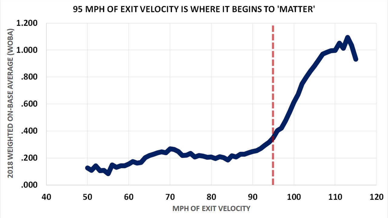
Quite simply, that’s the round number where performance starts to take off. However, hard-hit rate has generally been the worst of the three exit velocity methods in terms of predicting future offensive performance. When I analyzed year-over-year changes, 10.9% of players raised or increased their hard-hit rate by more than one standard deviation, the highest of all three methods. Further, while 95 mph is where performance starts to take off on batted balls as a whole, it’s not the best threshold for evaluating players. As you’ll see in some of the graphs that follow, over a long sample, the threshold that’s most predictive of success for an individual player is closer to 101 mph.
So those are the three methods. I decided to be excruciatingly thorough. Remember how Tom Tango calculated best speed at intervals of five percentage points? I calculated each metric one integer a time. That is to say, I calculated each player’s EV1, then their EV2, then their EV3, and so on up to EV100 (which is also their max exit velocity). I did the same thing with best speed, calculating the average exit velocity of their hardest-hit 1% of batted balls, then the top 2%, and so on up to 100% (which is also their average exit velocity). Lastly, I calculated their hard-hit rate 1 mph at a time, calculating the percentage of balls over 1 mph, then 2 mph, and so on. The hard-hit data was only useful between 9 mph and 122 mph, so that left me with 314 ways of analyzing each player’s exit velocity. Then I calculated correlation coefficients between those 314 sets of numbers and each player’s wOBA, wOBAcon, and ISO.
This exercise really drove home the importance of sample size. It really, really matters. The less information you have, the more you should care about the top end of the scale. Here’s the correlation between wOBAcon and each of our three methods over the course of our biggest sample.
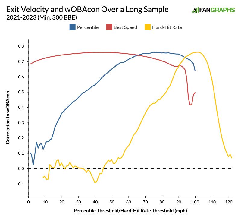
Let’s remember the reason that exit velocity is so useful. Like so many other new metrics that allow us look at things more granularly, the benefit of exit velocity is that it stabilizes much more quickly than traditional stats. If we have several years of data for a hitter, their performance will speak for itself and we won’t need to check their exit velocity very often. We’ll care about it when things start to change, so we’ll be looking at a smaller sample size.
With that in mind, take a look at the graph below. It shows the correlation between exit velocity percentile in one season and wOBAcon in the following season. Keep in mind that in the graph above, when we combined all three seasons worth of data and looked only at players with at least 300 balls in play, the threshold that was correlated most strongly with wOBAcon was EV74.
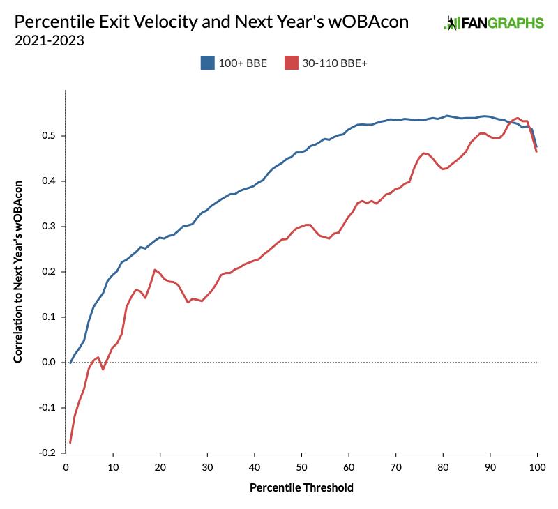
In a single-season sample of at least 100, the predictive power peaks at EV81, but it’s roughly as reliable anywhere from EV70 to EV90. But if the player has a smaller number of balls in play, predictive power peaks at EV96, and the reliability window is much smaller, only from EV94 to EV98. Over the long run, the ability to make solid contact consistently is extremely important. But when there isn’t enough time to demonstrate consistency, success is most strongly correlated with the ability to really crush the ball. The difference is even more stark if we look at best speed.
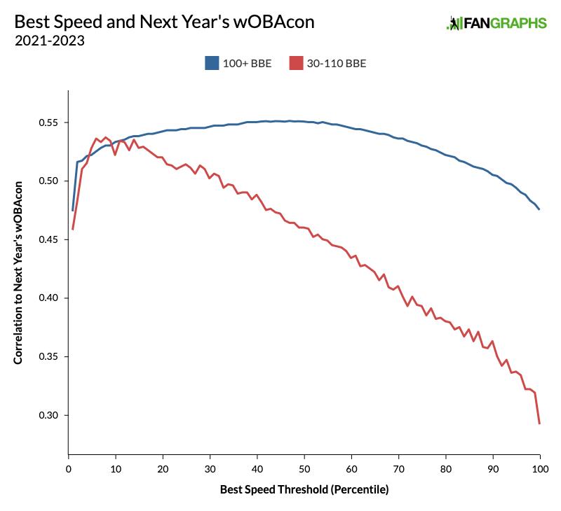
The blue line looks fairly similar to the graph that led Tom Tango to set best speed at 50%. Really, looking at anywhere from the top 35% to the top 60% of batted balls would give us a similar prediction for the next year. But for a shorter sample, if we want to predict how a player will do next year, we should discard 92% of their sample and look only at the average exit velocity of the hardest-hit 8% of their balls in play.
The hard-hit rate graph is much messier, but the lesson is the same.
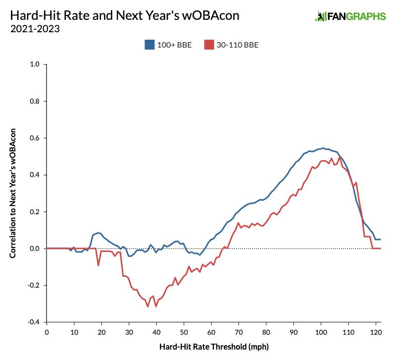
With a bigger sample, hard-hit rate is most predictive when the cutoff is set at 101 mph, but it’s roughly as effective anywhere between 98 and 104 mph. With a smaller sample, the threshold should be set at 107 mph.
You might not have noticed it, but in all three of the previous graphs, the blue line topped out at either .54 or .55. At its peak, each method is just about equally useful at predicting how successful a player will be when they put the ball in play next season (as well as predicting their overall wOBA and their ISO). Provided you set your threshold at the right level, none of these three methods stands head and shoulders above the others. There is no one metric to find them, one metric to bring them all and in the dark bind them.
That said, after digging into all of this data, I think that I personally will be much more likely to use best speed going forward. The caveat I just gave, “provided you set your threshold at the right level,” matters quite a bit, and best speed’s threshold has got the most margin for error. For example, take our longitudinal study. Here’s how each method correlated to a player’s ISO over a sample of at least 300 BIP.
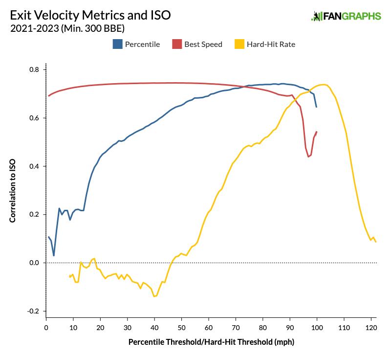
All three metrics peak at r = .74, but look at how much longer best speed stays in that ballpark than percentile and hard-hit rate. Percentile is not far behind it, and looking at these graphs, I can see why teams have chosen EV90 or something close to it. Hard-hit rate is much more finicky.
That segues into the second reason that I plan on using best speed going forward: it’s easy to find. Since I’ll rarely need to recalculate it myself based on the sample size, I can just pull it from Baseball Savant. If you want to know a batter’s EV80, EV90 or EV95, you’ll likely need to pull the data and calculate it yourself, and that can be a pain. Despite being finicky, hard-hit rate is the easiest to pull if you’re looking at a particularly small sample size. In fact, here’s a Baseball Savant search query ready to go with a threshold of 107 mph. Just adjust the dates to suit your needs.
One other benefit of best speed is that in any season, the average among qualified batters tends to be right around 99.7. That makes interpretation pretty simple: 100 or higher is good, 99 or lower is bad. I think that ease of use is an extremely underappreciated part of today’s advanced stats, and having another go-to metric that’s easy to understand will make a big difference.
There are always going to be new ways to think about average exit velocity. Two years ago, Ben Clemens came up with the idea of hard-hit balls per swing. If you don’t like that, how about hard-hit balls per pitch in the strike zone? Unsurprisingly, Corey Seager comes out on top there. As I said at the beginning, I’m sure that all 30 teams have a report that looks roughly like this one, though perhaps with fewer Lord of the Rings references. Best speed and EV90 may not have been forged in the fires of Mount Doom, but they’ll get you most of the way there.
Source
https://blogs.fangraphs.com/the-doomed-search-for-a-perfect-way-to-interpret-exit-velocity-data/
 Backyard GrillingWeekend WarriorsAdvice from DadBeard GroomingTV Shows for Guys4x4 Off-Road CarsMens FashionSports NewsAncient Archeology World NewsPrivacy PolicyTerms And Conditions
